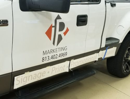
Signs are usually meant to be viewed from a distance, which means you’ll need to choose fonts not only for style, but also for readability. Many people seem to find script styles and serif fonts difficult to read, but some sans serif fonts pose readability challenges as well.
For example:
- Sans serif fonts with wide letter spacing make the gaps between words less obvious.
- Fonts that crowd letters together make it hard for people to distinguish between each letter.
- Fonts that are too bold tend to look crowded.
- Fonts made with very thin lines tend to get lost in the background.
- To test a font for readability, back away from your monitor and read it from a distance.
If you are having trouble choosing a font or need some design help look no further! We have designers standing by to make sure your customers aren’t saying- “What the Font?”


